
Client:
Fratelli Branca Distillerie
My Role:
Art Director
Year:
2012
Service Provided:
Web Design, Art Direction

Problem
The old Fernet-Branca portal was visually outdated and completely disconnected from the brand's historical identity.
The aesthetics did not enhance the brand's iconic codes, appearing generic and unrecognizable.
The user experience was also poor: navigation was unintuitive, content was static and there was no engaging narrative.
The portal failed to communicate Fernet-Branca's value and personality, nor to attract a younger, design-conscious audience.
My Role
I led the art direction, transforming the brand identity and photographic material into a distinctive interface.
I was responsible for every visual detail, coordinating with the client and created all the necessary graphic resources for the web and responsive versions.
I was also responsible for developing presentation materials and mockups.
Process
I worked closely with a strategist, an account manager, a developer and the client, to translate the vision into a distinctive and effective solution.
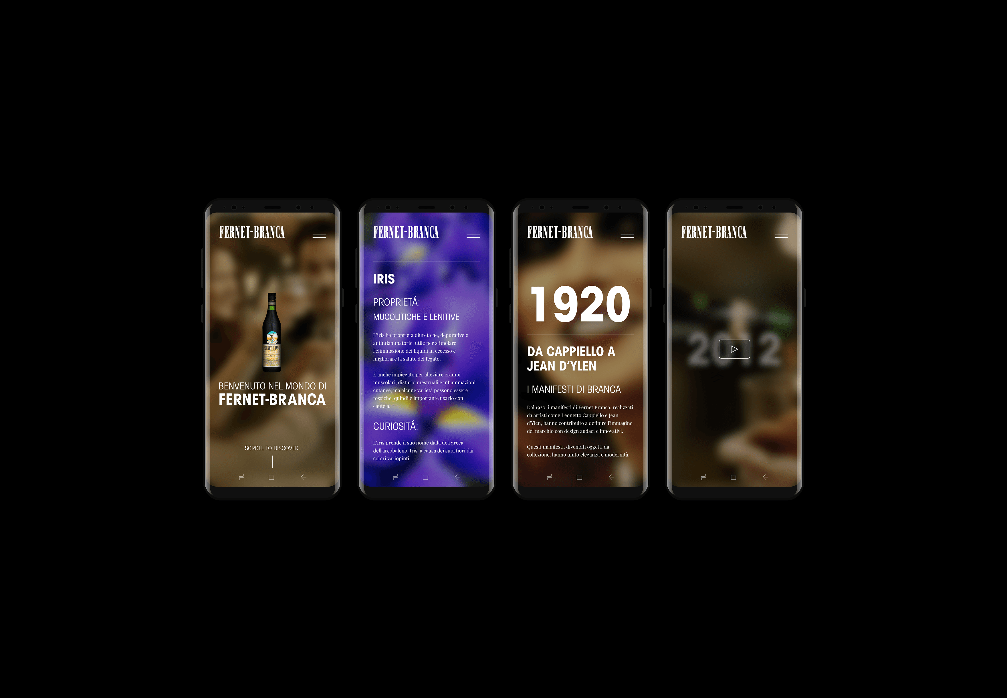
I created all the interfaces, meticulously refined every detail and delivered a complete set of assets for development, including responsive versions.
In addition, I developed mock-ups and a final presentation to clearly communicate the end result to the client.
Solution
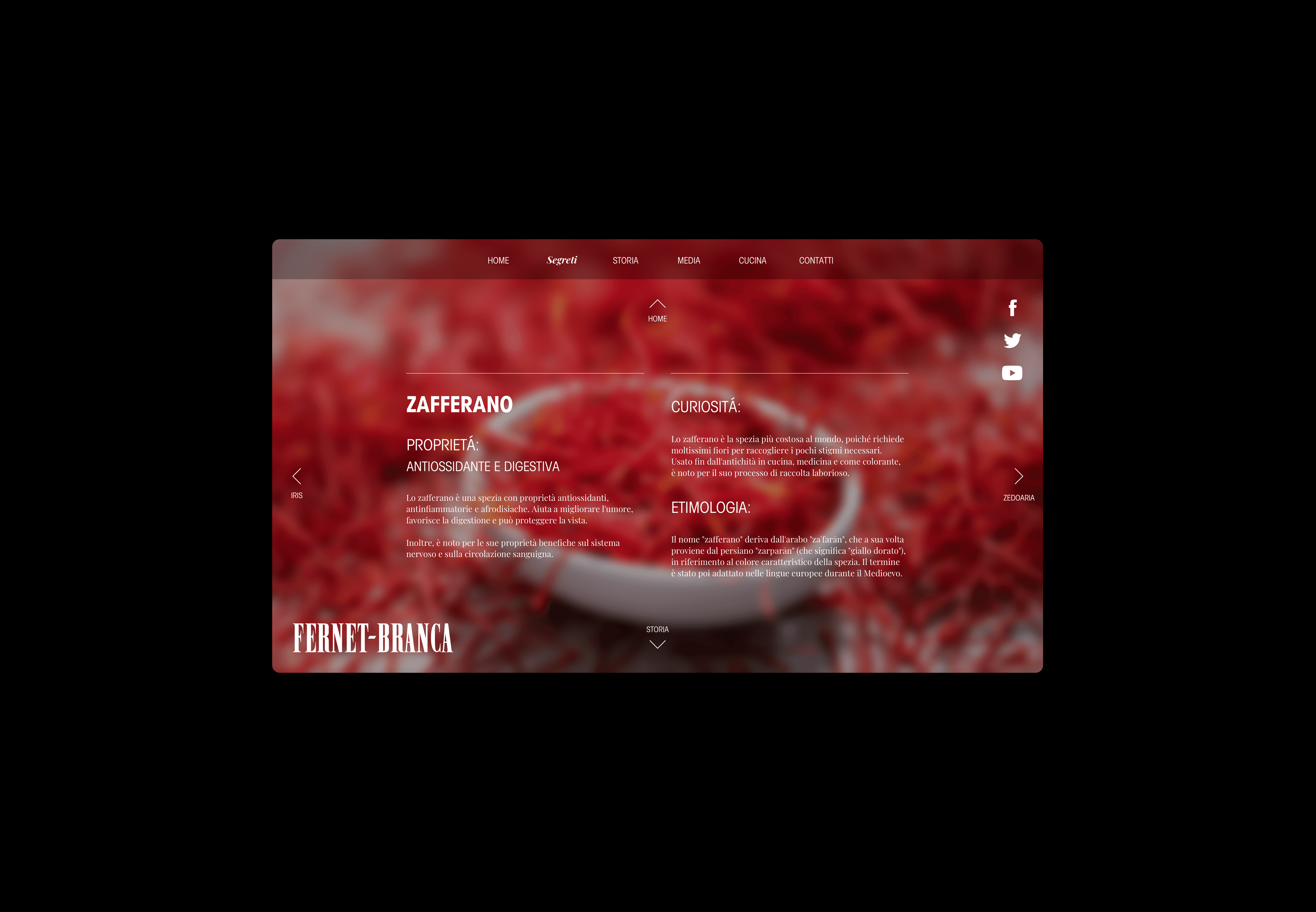
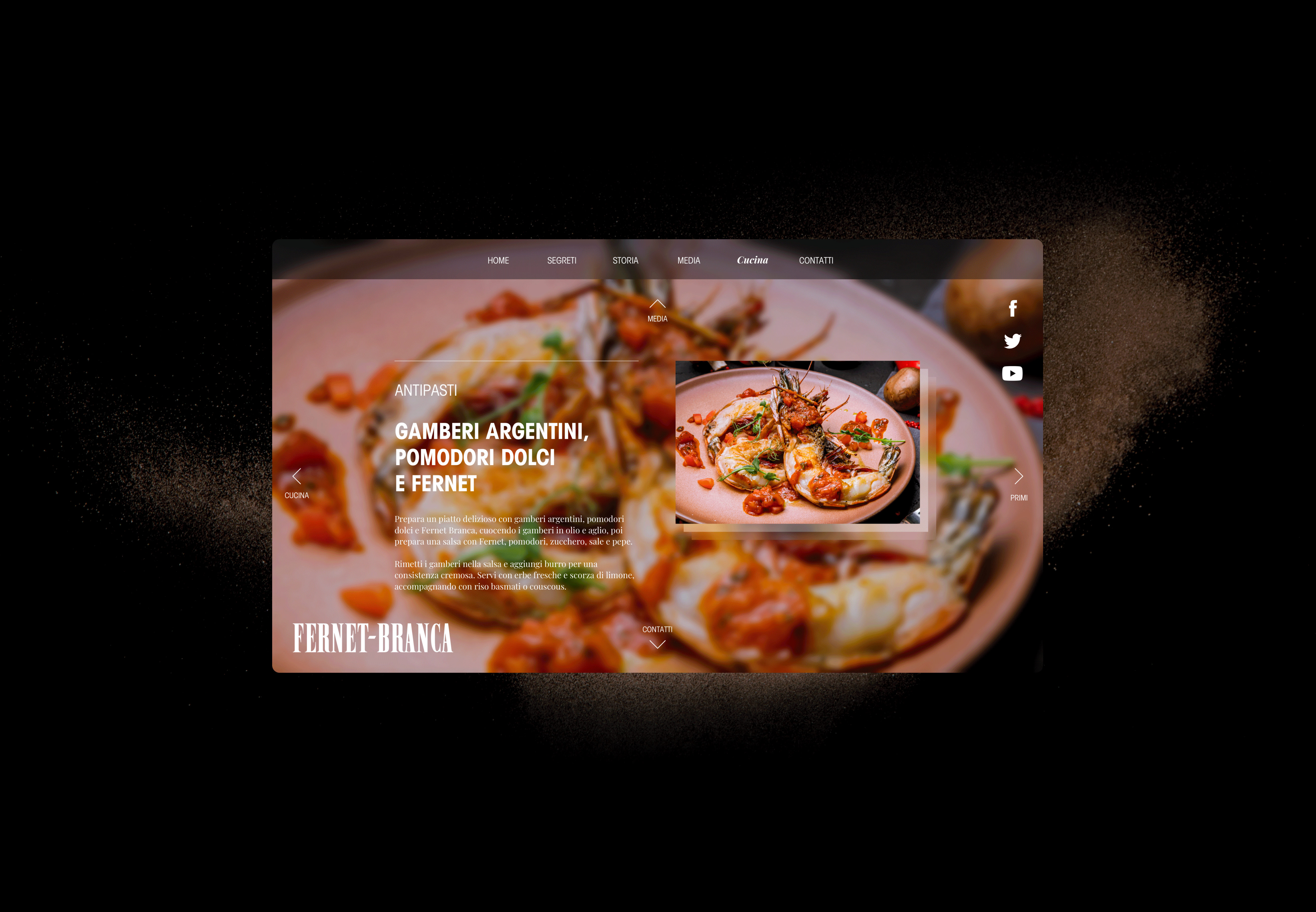
The website design uses a dual-axis navigation: vertical scroll for main sections and horizontal scroll for sub-sections, creating an intuitive and immersive user experience.
Each page features a blurry vintage background from Branca Distillerie's historical archives to highlight the featured graphics and reinforce the brand's rich heritage.
The logo is positioned bottom-left to avoid interfering with navigation, while social links are placed top-right.
A carefully chosen pattern and visual language evoke the brand’s core values, creating a warm, recognizable environment that supports product discovery and purchase.
Results
+40%
Average session time
+25%
Direct traffic
-18%
Bounce rate
Special thanks to: Marco "Raizen"
Next Project
