Client:
Talent Garden Innovation School
My Role:
UX/UI Designer
Year:
2021
Team:
3 Designers, 2 Developers, 1 Marketer
Reading Time:
~7 min
Service Provided:
Discovery, UX Design, Testing, UI Design, Design System
The Challenge
Covid removed the informal aspect of language learning, the kind based on spontaneous conversation. Existing apps focused on structured lessons or a matching system, ignoring the informal, playful energy that comes from talking to a stranger in a foreign country.
Key User Needs
Easy access to real conversation partners
Freedom to choose language, topic and conversation style
Engagement features to sustain motivation over time
A safe, inclusive space for users of all skill levels
Process
Talkwithme was designed in 6 weeks during the UI Design Master at Talent Garden Innovation School, in a team with designers and developers.
The work followed 4 phases: discovery (benchmark, proto personas, customer journey), design (flows, wireframes, prototype), testing (5 users, task-based) and delivery (style tile, UI, deck).
Benchmark
Language apps fall into 2 groups. Some teach grammar but don't let users talk. Others connect users but don't help them learn. Talkwithme was designed to do both.
Educational | Social Exchange | Talkwithme | |
|---|---|---|---|
Apps | Babbel & Duolingo | HelloTalk & Speaky | Talkwithme |
Method | Structured lessons, grammar exercises | Free chat with native speakers | Live video calls with gamification elements |
Strength point | Clear progression, daily habit | Real-world exposure, no scheduling | Natural, free-flowing conversation |
Weakness point | No human interaction | No learning framework | – |
Outcome | Users know words, can't speak | Users connect, don't progress | Users speak and progress together |
Insights
Real conversation is what's missing. Educational apps teach words, but users still freeze when they have to speak. Talkwithme puts the live call at the center, not on the side.
Gamification works only with a goal. Duolingo shows that points build habits, but points alone lose meaning. Talkwithme ties points and rankings to real conversations, not solo exercises.
Community keeps users more than design. HelloTalk keeps users longer than Babbel, even with a weaker interface. People stay where they feel they belong. Talkwithme builds the community first, then refines the design around it.
Talkwithme is not a teaching app and not a chat platform. It's the bridge between the 2: real conversations with real people, made to be played, not studied.
Personas
3 proto-personas shaped Talkwithme's design: a hesitant starter, an immersive learner and a driven achiever.
Why Laura. The hesitant starter drove the biggest decisions: level-based matching, no-blank-screens and the home as action screen. The other two personas validated the choices. Laura made them.

The other 2 personas followed the same structure, covering different motivations and friction points.
Customer Journey
We mapped Laura's journey across 6 stages, from the moment she first hears about Talkwithme to her arrival in Madrid two months later. Each stage shows what she does, how she feels, where she struggles and how the product responds.

Each persona has its own journey. Laura's journey marked the same problems we found later in user testing. The 40% drop happened where her journey said it would.
User Testing
The test wasn't about confirming the design. It was about finding where it broke. 5 users (ages 25–35), 4 core tasks, 70% average success rate, with one clear signal:
Task | Success Rate |
|---|---|
Start a video call | 40% |
Use all video call functions | 60% |
Rate the call and add partner as friend | 100% |
Manage personal account settings | 80% |
The 40% on the core task has driven the next iterations:
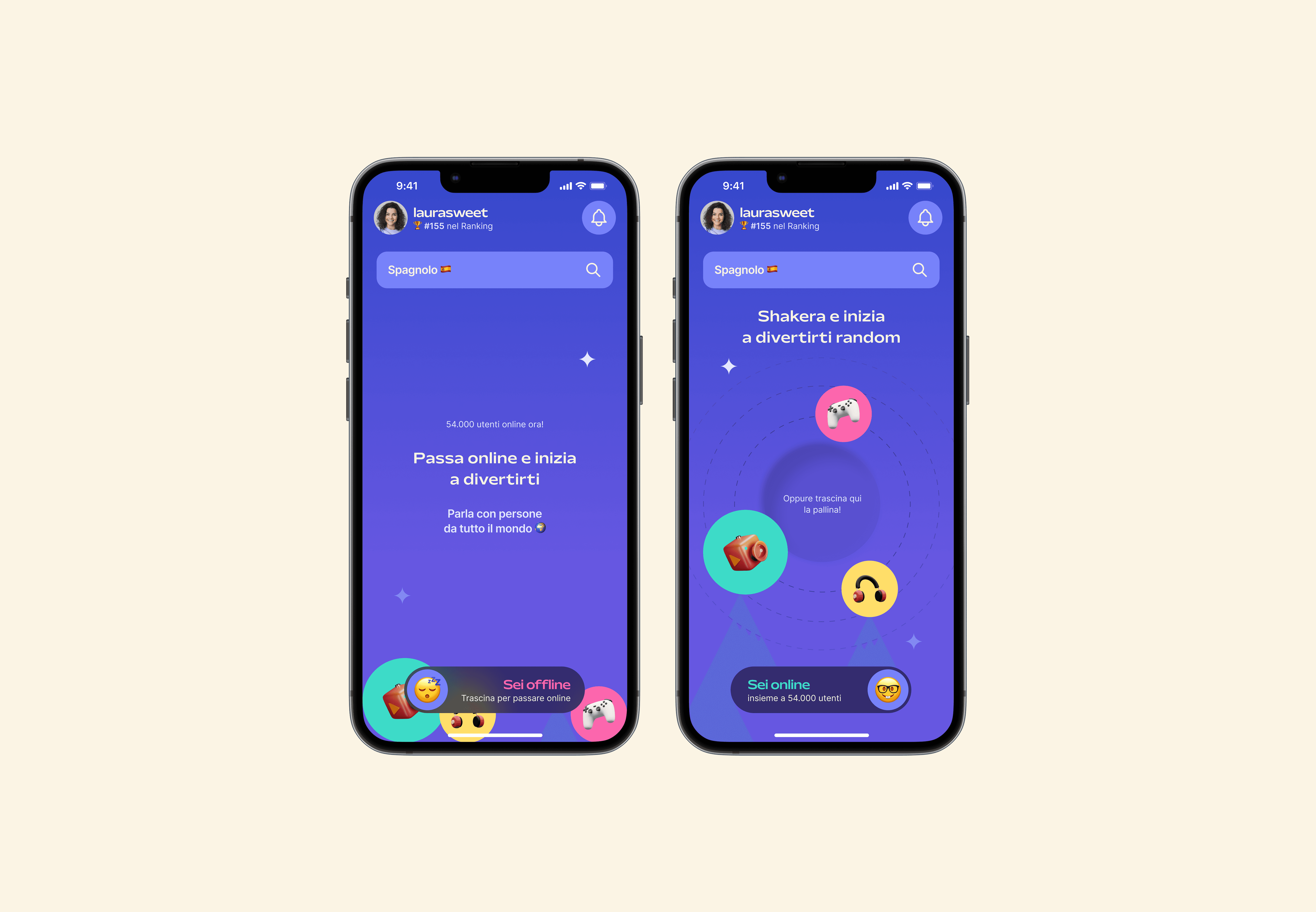
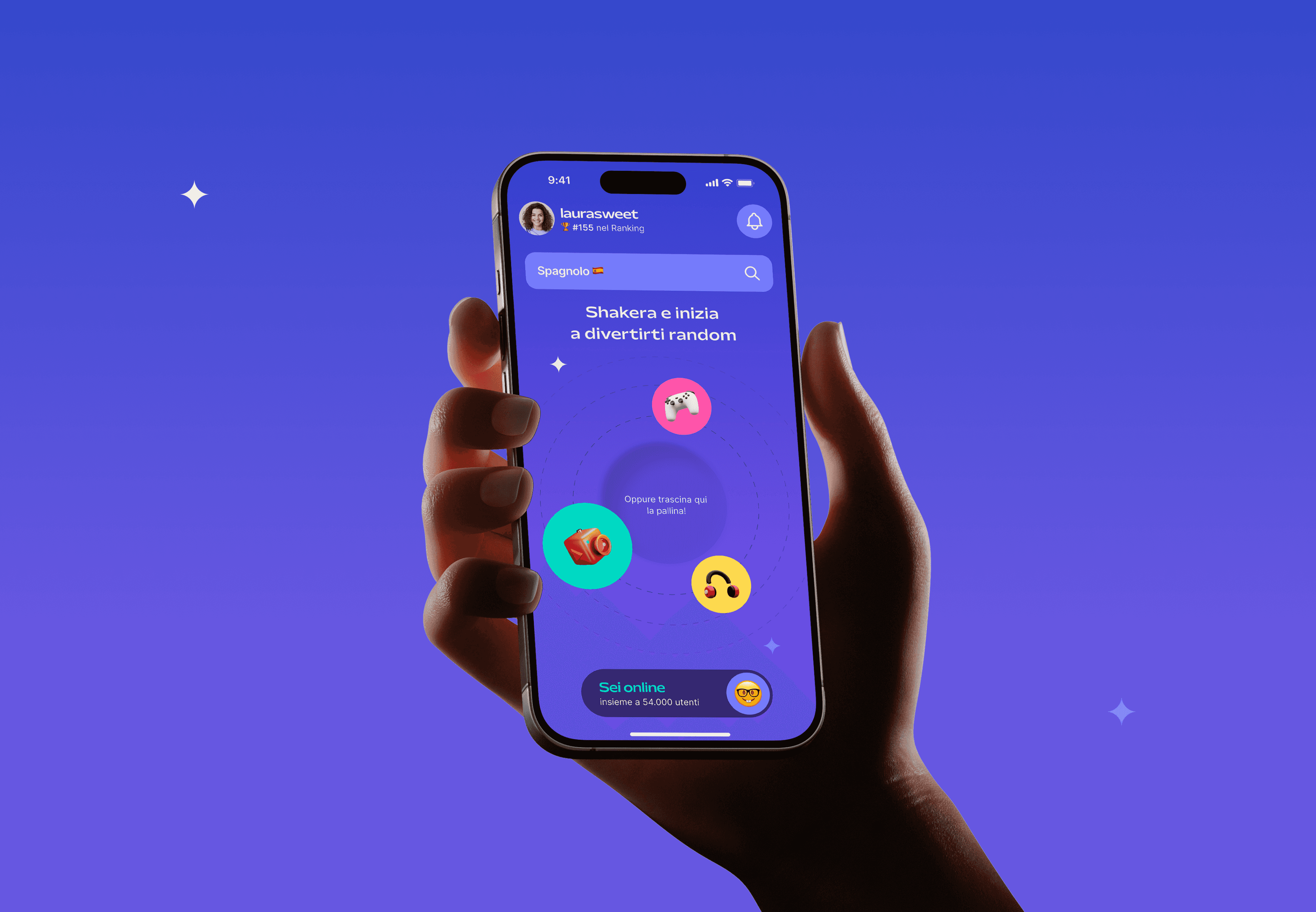
Drag to go online: status switch as a gesture
Shake for random, drag to choose: 2 ways to start from the home
3 balls replace the tab bar: navigation feels like play, not a menu
The Matching Decision
Most apps use many filters: age, gender, interests, bios. It feels safe but slows action.
Talkwithme keeps 3: partner, age and time. No profiles to browse, no perfect match to find. Just set the basics and start.
Some matches will not work, but less friction means more practice. When users choose too much, they hesitate. When the system matches them, they speak.

3 filters, no more. Just enough to feel safe, not enough to stop the user.
Design Principles
These principles also provided the foundations of the design system, ensuring consistency across every screen.
Fun over formal: language learning designed as social play, not study
Personalized over generic: the experience adapts to user preferences and skill level
Spontaneous over scheduled: low-friction connections to meet new people instantly
Gamified engagement: motivation driven by progression, rewards and ranking
Inclusive by design: accessible to all skill levels, languages and backgrounds
Solution
5 product moments that turn Laura's needs into design decisions:
Onboarding & Profile

Onboarding. 6 visual steps under 90 seconds. Long forms lose hesitant users before the first call.

User Profile. Languages, interests, ranking and call history in one view. Without a record of progress, gamification feels like decoration.
Core Experience

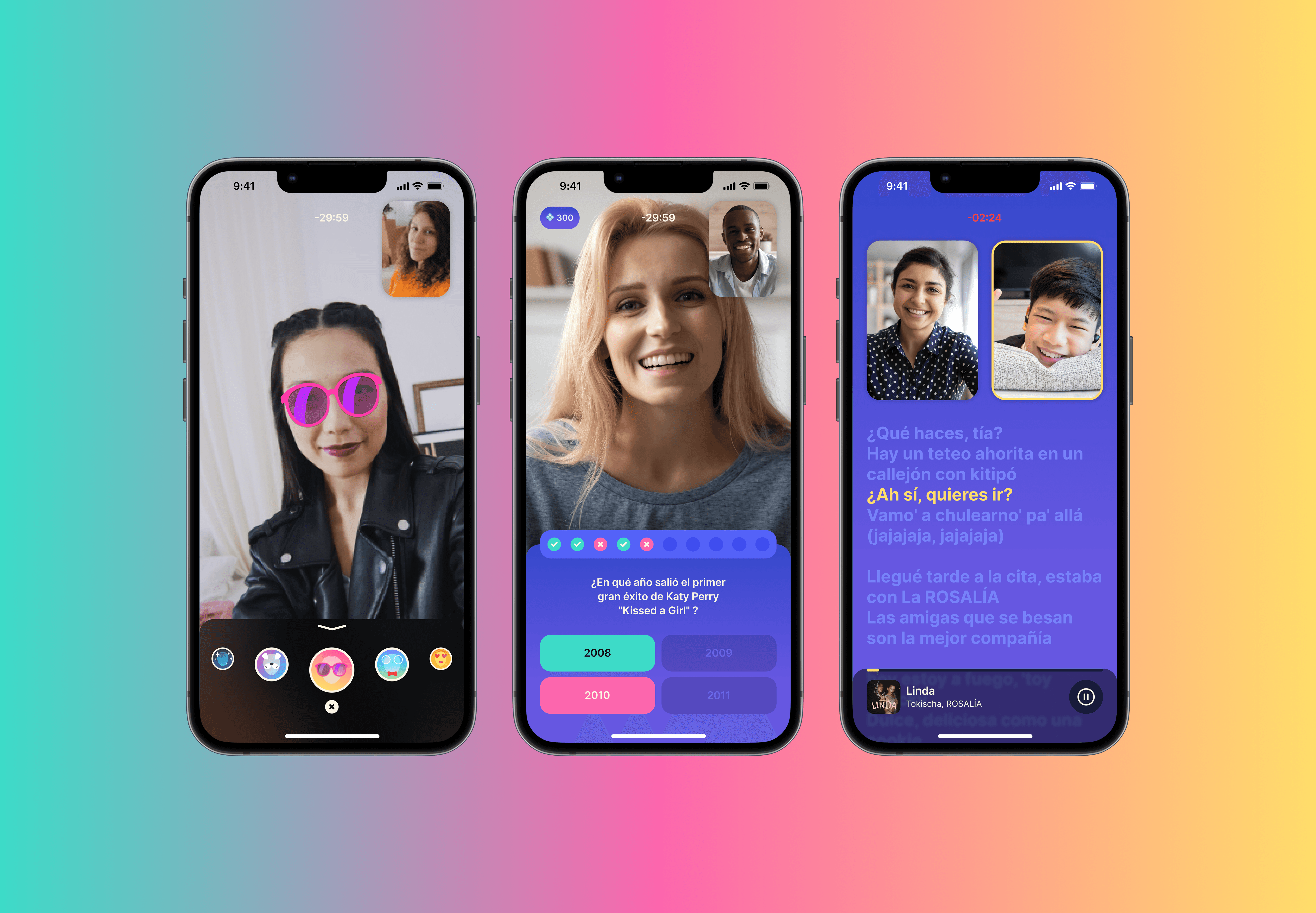
Matching + Talk. 3 random partners, 1 user choice. Random removes hesitation. It keeps users in control. A quiz fills the wait, turning empty time into practice. In the call, stickers, filters and chat keep the talk flowing when users freeze.
Engagement & Learning

Game. Users get points only after real conversations. Solo exercises don't count. Points that don't follow real actions become noise.

Karaoke. The first 30 seconds of a call are the hardest. Singing replaces them with a shared activity. No silence, no pressure.
Deliverables
2 outputs from this project, both available to explore:
Interactive prototype: walk through onboarding, profile, video calls and in-call features. Best on mobile view. Try the prototype
Final presentation: the deck delivered to Talent Garden stakeholders, covering research, design decisions and the final UI. See the deck
Learnings
5 users are enough. A small focused test showed the 40% drop on the core task. That finding drove every iteration. You don't need scale, you need attention.
Discoverability is the feature. A function users can't find doesn't exist. Moving the Talk CTA from a hidden tab to the home screen mattered more than any other change.
Gamification needs a goal. Points and rankings work only when they support real behaviour. As decoration, they become noise. Every Talkwithme reward is connected to a real conversation.
The home is not a waiting room. Users don't want to walk through a menu to reach the product. They want it on the first screen, one gesture away.
The best decisions weren't the most beautiful. Some of my favourite UI ideas didn't pass the developer review. What stayed was simpler, faster to build and better for the user. Limits shape design more than vision does.
6 weeks on Talkwithme showed me one thing: scale doesn't make a project serious. Method does. 5 users, 4 tasks and one clear signal. It was enough.
Thanks to: Alessandro, Luca, Mara, Anita and Annamaria
Next Project